Saturday, 14 November 2015

Our Finished Album Cover


I have made our finishing touches within our Album by adding small tweaks that contribute to the realistic side of the spectrum. We flipped the logo on the opposing side so that when it reaches the shelves it can be noticed through the A-Z product line. We added some more songs that reflect many different meanings as if they are past experiences that we have been put through. We also changed the Universal logo into a more realistic and not as big production studio. Beggars Group. Lastly we added a with thanks message with a photo, so that buyers understand how great-full we are for them to buy and listen to our music. 

Friday, 13 November 2015

Our Album Completed


Here is my finished digi pak design, which I created using Photoshop. For the front cover, I decided to use the wide shot of our band so it gives the audience an insight of the type of band we are. It gives us a sense of individuality and presents us an organic band. The clothes we are wearing are not of any specific interest as we are classified as an indie organic rock band so we like to connect with our audience by making as look like normal everyday citizens.We decided to take a picture of us performing different poses to again accentuate the idea of being individual but as well to cohere with the Ramones album. I chose the colours as it links back to Primate but it also adds an authentic look that gives it its difference towards other indie albums, as if the past is being re-invented into the future. Also the Ramones, Stone Roses and the 2000's The Strokes, also use black & white within their covers and photo shoots. The name Walls also gives it a mysterious/conspiracy feel as we could be portraying many different things relating to the characteristics of a wall. It raises questions such as... 'What is on the other side? When will it end?'. Hence why I named one of the songs 'Jaded' as it means being bored, therefore our audience may think that it represents the simplicity of a dull wall or dead end in which we make it sound more interesting as it is such a broad idea.

We used this type of font (Floydian) because it was the closest to getting it to look like it was embedded into the wall as if we had painted it on. I positioned it behind our heads and slightly erased some of it so it would look a little more realistic because it would of been illegal to paint on the wall.

Thursday, 12 November 2015

Updated Album Cover and Steps

We mad a few finishing touches on our album cover and we will tell you the steps made to produce the artwork.


This change includes a cropped version so less space is exposed. I added a gradient to which it makes the central focus either the logo or the band. We started it off by taking pictures of the band against a dull dirty wall and incorporated Kings of Leon's pose by making random ones up. I edited it in Photoshop and used a black and white filter. I then experimented with many texts and found the Floydian one to be the most realistic one that would look as if it has been embedded onto the wall. I layered the image and placed the text behind the band making it look like graffiti.

Wednesday, 11 November 2015

Finished Album Cover

We created a survey and asked at least 30 students around the school which album cover they liked the most. In-fact 25/30 said it was the album cover that's bellow the text. Knowing that they like this one the best seems promising as it accentuates an organic/indie feel to our band. We also chose it because it is original and is deemed 'cool' by other students. It contains our band with the logo embedded behind us as if it has been inadvertently printed on a 'Wall'.


Album Cover Part 2

After taking some pictures I used photoshop to edit them, making them sharper and having cool vignette's. I tested and experimented with the effects that I can use on the font and placed it in many positions. Here are the pictures:


Our Photo shoot for the Album

We had a small photo shoot in school to finalise our idea on the album cover. We decided that we wanted to use a clear but dirty wall to make it simple yet ironic with the name of the band. It makes it seem as if we are controlling what has been going on behind the walls, which may generate many different meanings that will create a hype. We also decided to wear our own clothes that represent each-others qualities. This is purely because we are indie (individual) and like to keep things simple without revealing too many details, unlike synthetic artists who have to be glamorous and design the most revealing yet egocentric album covers to attract an audience. Our poses were influenced from the Kings of Leon, who all stand differently to show their individuality. We also used a background font to go behind our heads, sort of like the Ramones but with a more subtle and embedded look into the wall. Our font is still the same (Floydian) as it looks like a piece of edited graffiti that does not look too eccentric or eye catching. The main focus is to look like we are regular people who do not believe in flaunting everything we make or everything people see.


Tuesday, 10 November 2015

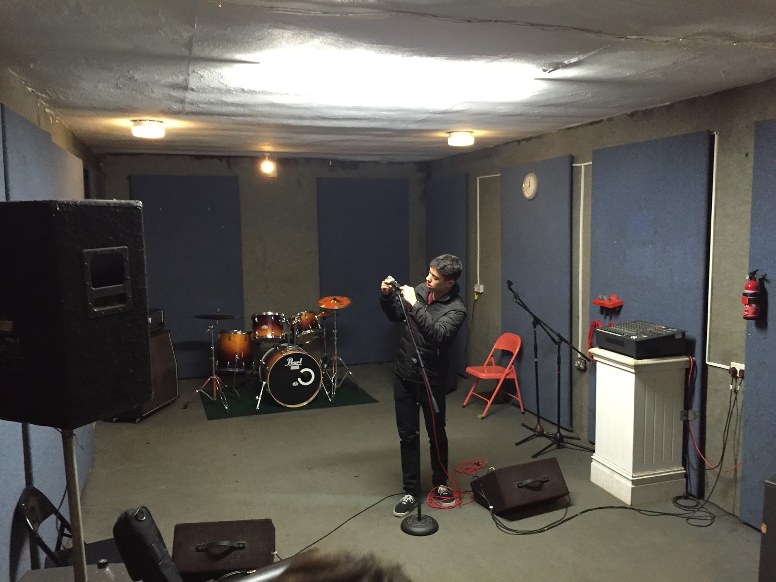
Shoot Day 1

Due to un-expected plans our narrative shoot day was interrupted as we found out we had a faulty tape which stopped us from doing it. However the week after we decided to attempt a performance element with the song what went down. We decided to book a studio in Mill Hill as it was cheap and the closest to making the performance element look as real as can be. We set up all the equipment and started to perform. None of us had actually listened carefully to the song so some of our song playing didn't cohere with the music. For example the main chorus includes many elements of techno instruments that have been edited carefully, hence why we weren't able to produce a smooth song and make it look like we are in time with it. We tried to use many different camera angles, such as man close ups of the singers face right up by the microphone just like in the original FOALS video. We also experimented by using many different close - up shots of the instruments, those like the ones in AC/DC's Thunderstruck where the camera is attached to the instrument. We also tried many wide shots of the band that looked decent as we all look like professional organic artists. However there were problems with the camera work, the footage was very out of focus as it was a new camera that we hadn't used before, the lighting we chose gave a very blurry grainy effect that didn't look 100% right as the room was especially dark. Our group was getting tired and quite stressed as were given a short time limit to film the song, so it was rushed at some points which lead to many mistakes that caused hesitations in the filming as well as irregular instrument playing. We also decided to turn the lights off at the beginning of the song which seemed good at the time but was actually a ignorant mistake as the lighting was dark already and we barely were able to see what the singer was saying, therefore it looked very amateur. Overall it wasn't a success but I managed to piece up the video to show that we have done something within this idea, so I incorporated my own type of teaser video of background footage of The Walls working on their new song. This will be shown in the next blog, but regrettably we have decided to change our idea because of this shoot day, due to the miscommunications and time between us, our new idea will not feature the same narrative and we will be filming in school. We will also be choosing a new song so we can make everything a little simpler so we don't spend so much time filming. However this footage didn't go to waste.